How user-centered design improved client engagement and lead generation
Background
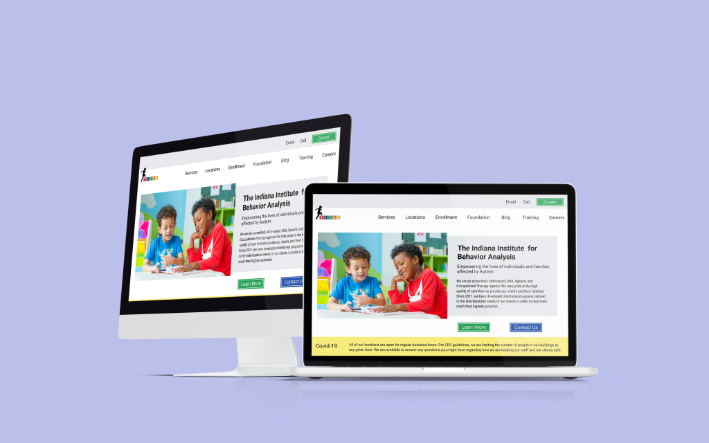
This was my first solo freelance website redesign project, and it turned out to be three websites in one. The project involved TIIBA, a mental health organization, as well as two related sites—one for their foundation and another for job seekers. Each site had a unique purpose, but all three struggled with poor user experience, lack of SEO, and confusing navigation.
TIIBA needed more than just a design refresh—they needed a strategic, user-centered approach to ensure that potential clients could easily access mental health services, job seekers could navigate career opportunities, and the foundation could better connect with donors and partners.
Project Brief
The main objective of this project was to create a search-engine-optimized, user-friendly design that would:
- Improve usability and navigation, ensuring visitors could quickly find relevant information.
- Enhance accessibility, making the site inclusive for all users.
- Boost lead generation, ensuring that potential clients and job seekers could take clear next steps.
- Increase search visibility, using strong SEO fundamentals to improve ranking.
- Reduce bounce rates, keeping visitors engaged longer.
This was more than just a design challenge—it required a holistic approach blending UX strategy, SEO research, and content optimization to create a functional and effective digital experience.
The Problem
When I first reviewed the websites, it was clear that they had severe usability issues that were actively hurting engagement and conversions.
The lack of visual hierarchy made the site feel disorganized, and critical information was buried under unclear navigation menus. Users struggled to complete simple tasks, and broken or misleading links led to frustrating dead ends.
One of the biggest issues was that the organization’s name was nowhere in the actual site text—only embedded in images. This meant search engines couldn’t properly index the brand, severely limiting visibility. Additionally, large uncompressed files were slowing down the site, increasing abandonment rates.
Without a strong SEO strategy or a clear content flow, the sites failed to support their audiences effectively—whether it was potential clients, employees, or donors.
The Goals
To address these challenges, my redesign aimed to:
- Decrease bounce rate by making navigation clearer and more intuitive.
- Increase session duration, keeping users engaged with well-structured content.
- Generate new leads, improving inquiry forms and calls to action.
- Enhance search engine rankings, ensuring the site could be easily discovered.
- Make the site fully accessible, following best practices for readability and inclusivity.
Responsibilities
As the sole UX designer and strategist on this project, I was responsible for:
- User Research – Understanding TIIBA’s audiences and their needs.
- Flow Mapping & Wireframing – Structuring an intuitive site journey.
- Visual & Interaction Design – Enhancing usability and accessibility.
- SEO Strategy & Content Optimization – Ensuring search visibility.
- Testing & Implementation – Refining the experience based on real-world feedback.
Tools Used
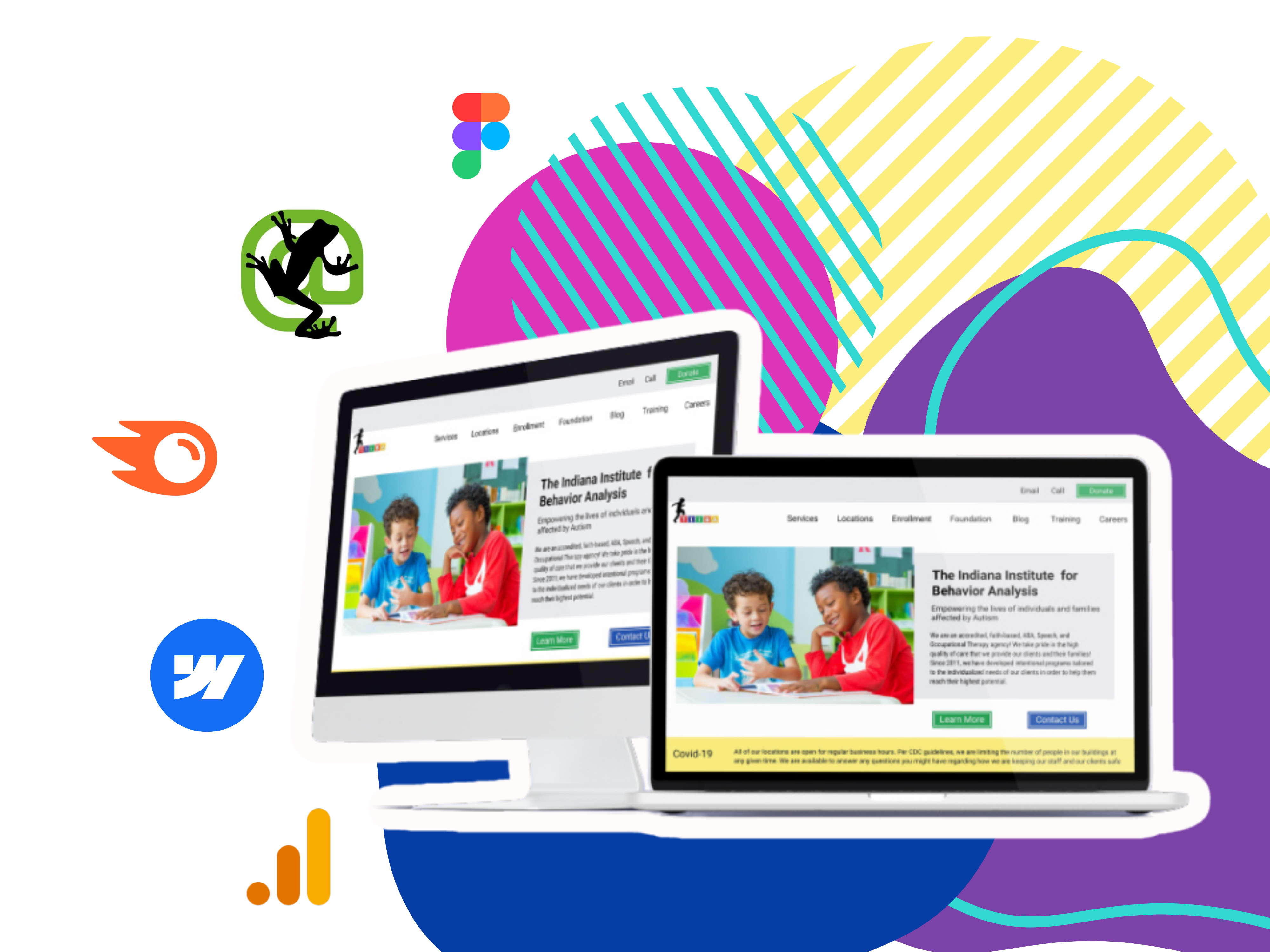
To execute the project, I leveraged a mix of design, research, and SEO tools, including:
- Adobe XD, Figma, WebFlow – For wireframing, prototyping, and development.
- Photoshop & Illustrator – For branding and custom graphics.
- After Effects – For subtle interactive elements.
- SEMRush & Google Analytics – To analyze site performance and keyword opportunities.
- HemingwayApp & Grammarly – To optimize content for clarity and readability.
Skills Leveraged
This project required a blend of technical expertise, creative problem-solving, and user-driven design thinking.
I leaned heavily on UX/UI best practices, ensuring navigation and information flow made sense for different audiences. My SEO knowledge was key to increasing search rankings and discoverability, while my content strategy experiencehelped refine messaging for clarity and impact. I also applied accessibility principles to ensure the site was inclusive and easy to use for a broad audience.
Strategy & Execution
I approached the redesign in several key phases, ensuring that every change was backed by data and user research.
Phase 1: Pitch & Client Buy-In
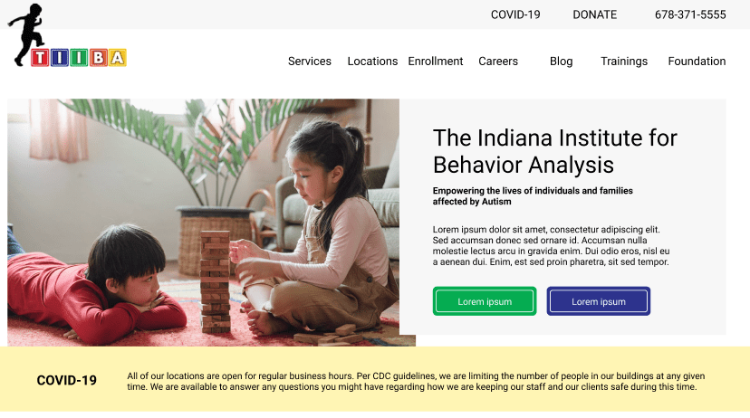
Before I officially started, I needed to convince the client that this project was worth investing in. Instead of just describing the improvements, I created a functional pitch mockup in Adobe XD, showcasing how an improved layout and navigation system could transform the user experience.
This secured the contract, allowing me to move forward with full-scale research and implementation.

Phase 2: Research & Site Audit
I conducted an in-depth SEO audit using SEMRush, identifying major ranking issues and content gaps. I then installed Google Analytics to collect baseline performance data and track improvements post-launch.
To gain a deeper understanding of the user experience, I developed two key personas:
- Potential clients seeking mental health services.
- Job seekers navigating career opportunities.
Through research, I identified pain points in their journey and used that data to inform my design decisions.
Phase 3: Flow Mapping & Wireframing
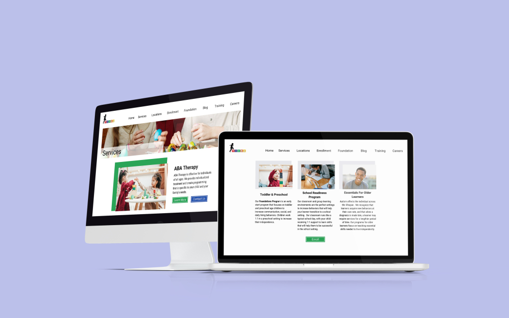
With clear goals in mind, I created a flow map to define the ideal customer journey. This ensured that visitors could:
- Find services quickly without unnecessary clicks.
- Apply for jobs easily, with a streamlined application process.
- Engage with the foundation through clear donation and volunteer opportunities.
Once the structure was finalized, I moved on to wireframing in Figma and Adobe XD, focusing on clean layouts, accessible typography, and intuitive navigation.
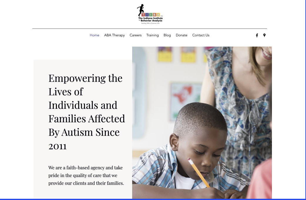
Phase 4: Design, Copy, & SEO Optimization
I redesigned the site with clarity, accessibility, and performance in mind.
- I optimized images and site speed, ensuring a fast-loading experience.
- I conducted keyword research and rewrote content with SEO best practices to improve rankings.
- I refined calls to action, making it easier for users to take the next step.
Phase 5: Testing & Launch
Before launch, I tested the site with real users, including mental health professionals and parents. Their feedback helped refine language, visuals, and functionality.
Once the final refinements were made, I installed Google Analytics tracking to monitor performance and ensure the site continued to function optimally post-launch.
Results
Client Outcomes
The redesigned websites led to higher engagement, increased conversion rates, and stronger search rankings.
- Users spent more time on the site, interacting with multiple pages instead of leaving immediately.
- Job applications increased as the process became clearer and more intuitive.
- The foundation saw improved engagement, with more visitors learning about donation opportunities.
Professional Outcomes
This project helped me grow in managing large-scale web redesigns. I refined my skills in SEO strategy, UX research, and content optimization, gaining a deep understanding of how design, content, and search visibility work together. It also reinforced the importance of data-driven decision-making, showing how even small changes could have a huge impact on user experience and engagement
